Thymeleaflet
A Storybook-like UI for Thymeleaf fragments.
Discover fragments, preview them instantly, and auto-generate usage examples
from JavaDoc-style comments embedded in your HTML templates.
Overview
A fast preview UI for verifying Thymeleaf fragments with confidence.
Stories and live previews keep the intent visible while you build.
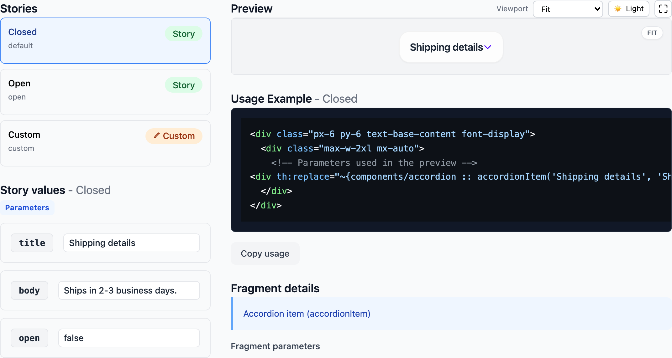
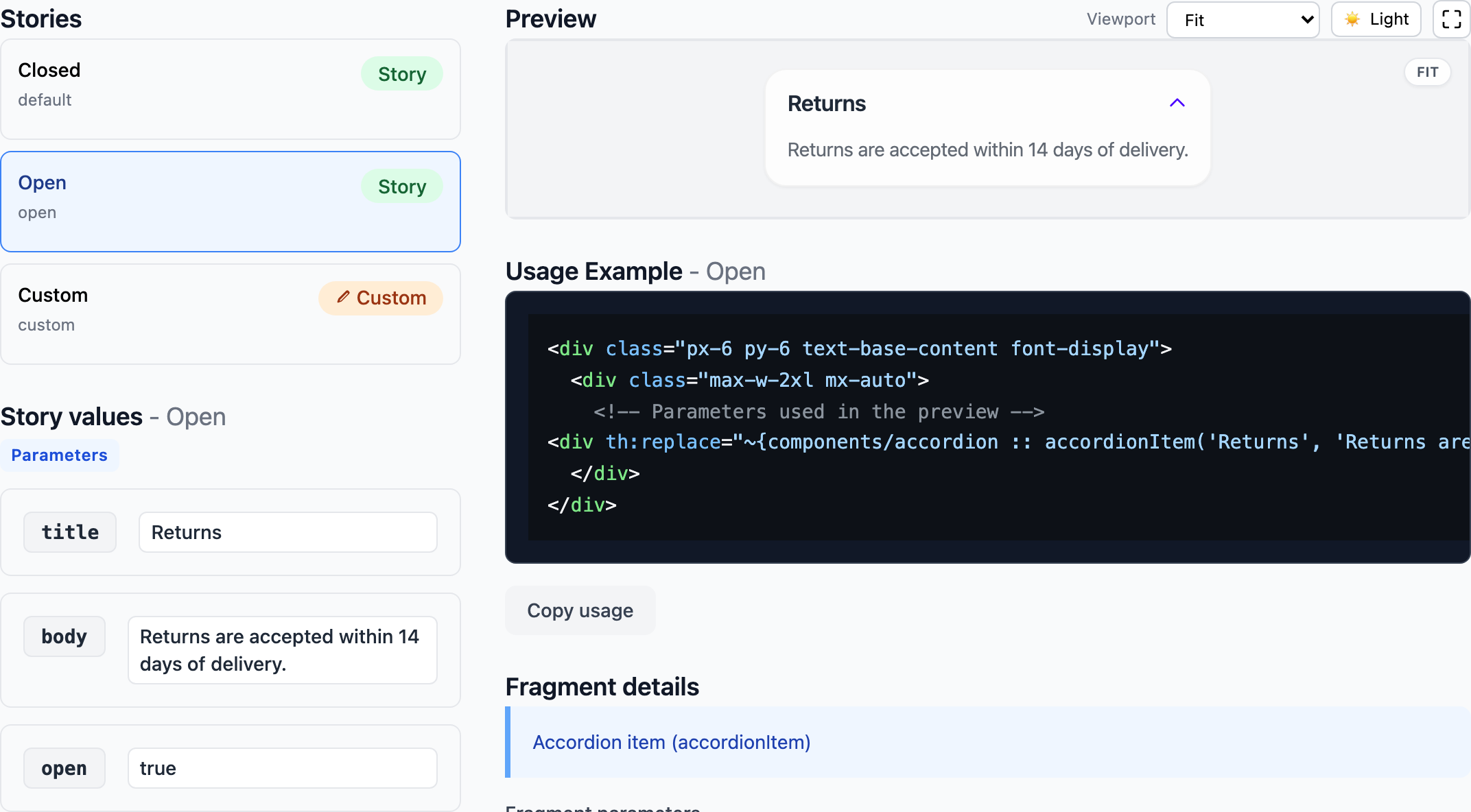
Story Authoring ({templatePath}.stories.yml)
Define UI variations in {templatePath}.stories.yml so states stay explicit and reviewable.
Store files under src/main/resources/META-INF/thymeleaflet/stories/.
Details: stories.md.
storyGroups:
  accordionItem:
    title: Accordion Item
    description: Vanilla JS accordion using inline handlers
    stories:
      - name: default
        title: Closed
        parameters:
          title: Shipping details
          body: Ships in 2-3 business days.
          open: false
      - name: open
        title: Open
        parameters:
          title: Returns
          body: Returns are accepted within 14 days of delivery.
          open: true
Live Preview Experience
Pick a story and the preview updates instantly.
Edit parameters and models in the same view, no context switch.
Missing story? You still get a fallback preview for quick checks.
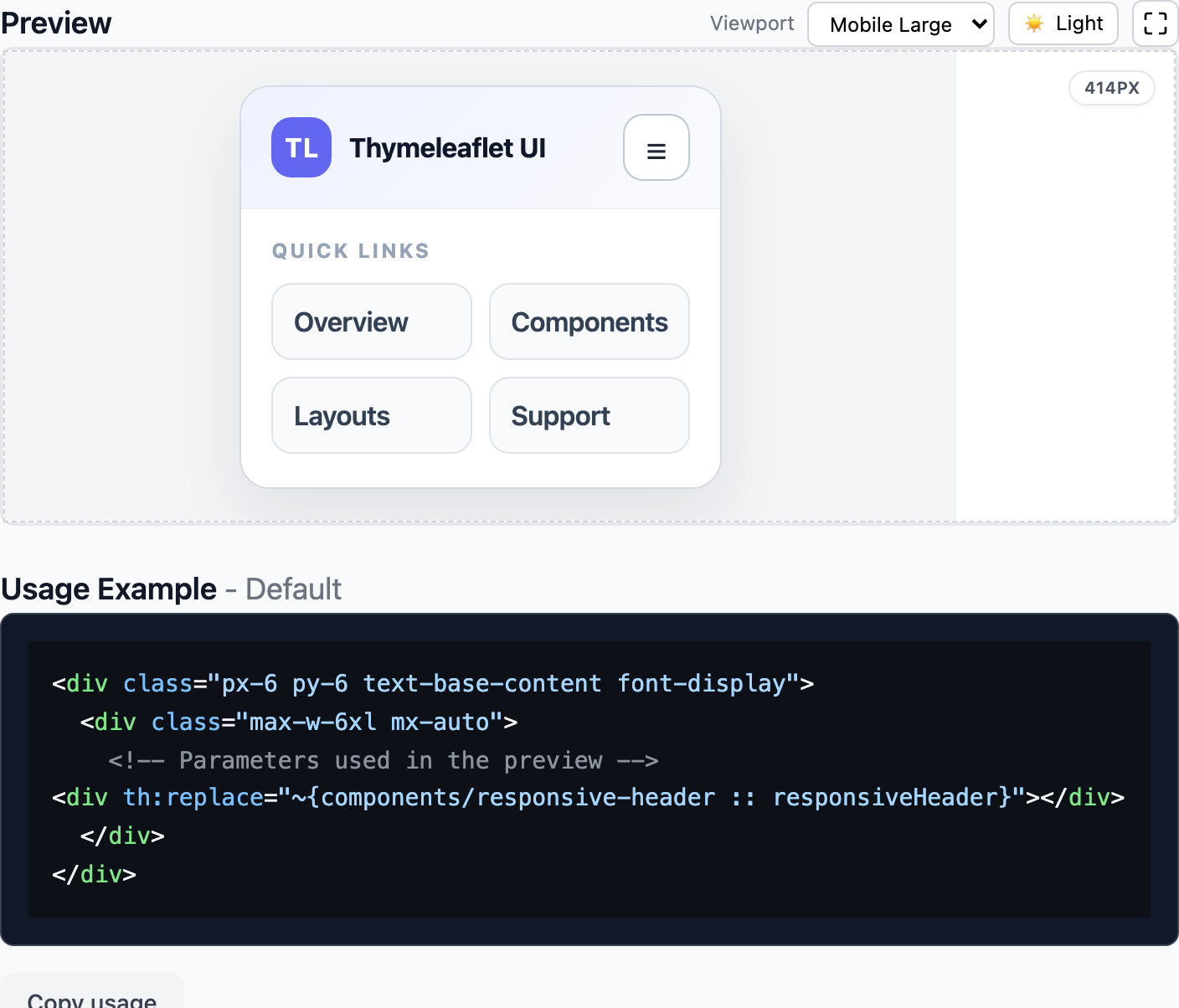
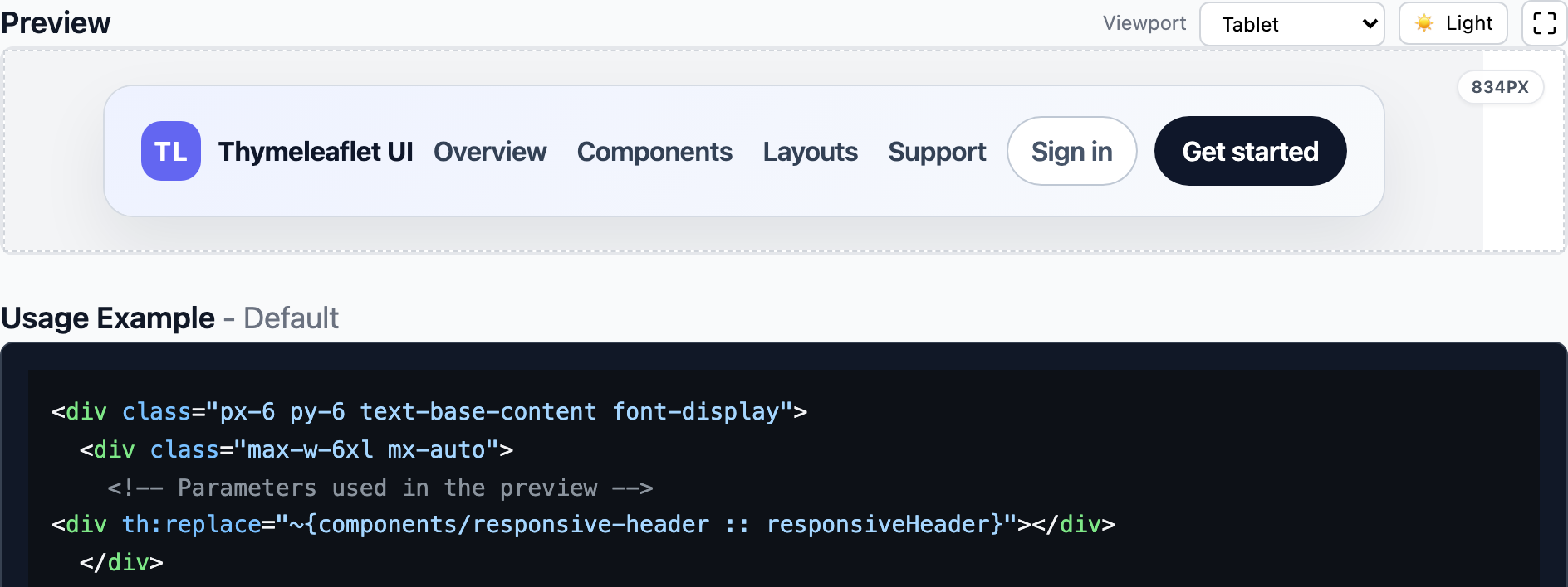
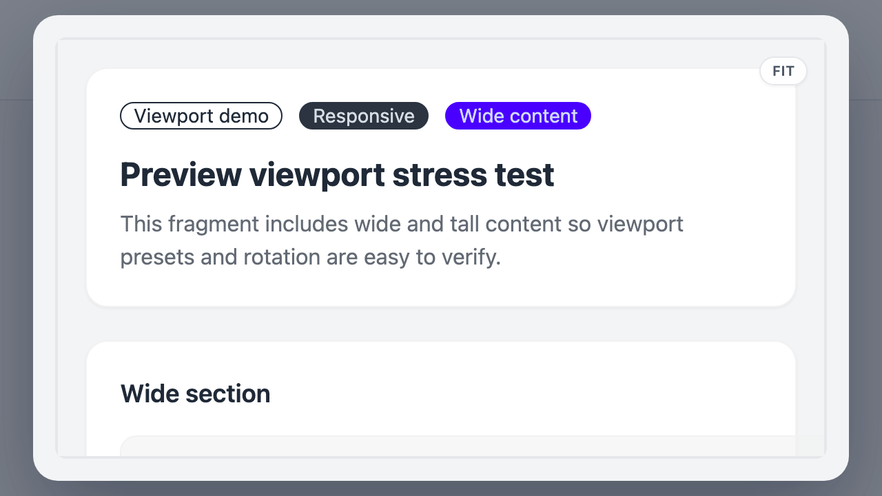
Viewport Presets & Fit
Switch between width presets (Fit / Mobile Small / Tablet / Desktop) to validate responsive layouts fast.
Height stays automatic, so you can review full layouts without clipping.
Fullscreen Preview
Pop the preview into fullscreen when you want maximum space.
Perfect for detailed QA.
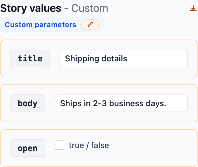
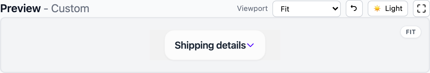
Custom Parameters
Edit parameters directly, even when no story exists.
Quick sanity checks without extra setup.
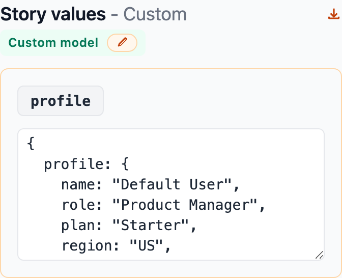
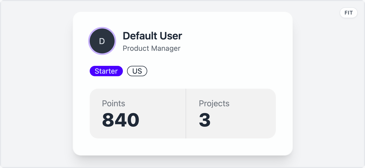
Custom Model
Provide Object-style models and validate model-dependent fragments in-place.
No leaving the UI.
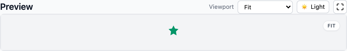
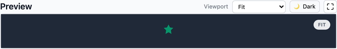
Background Toggle
Toggle light/dark backgrounds to confirm contrast and edge clarity.
Handy for UI polish.
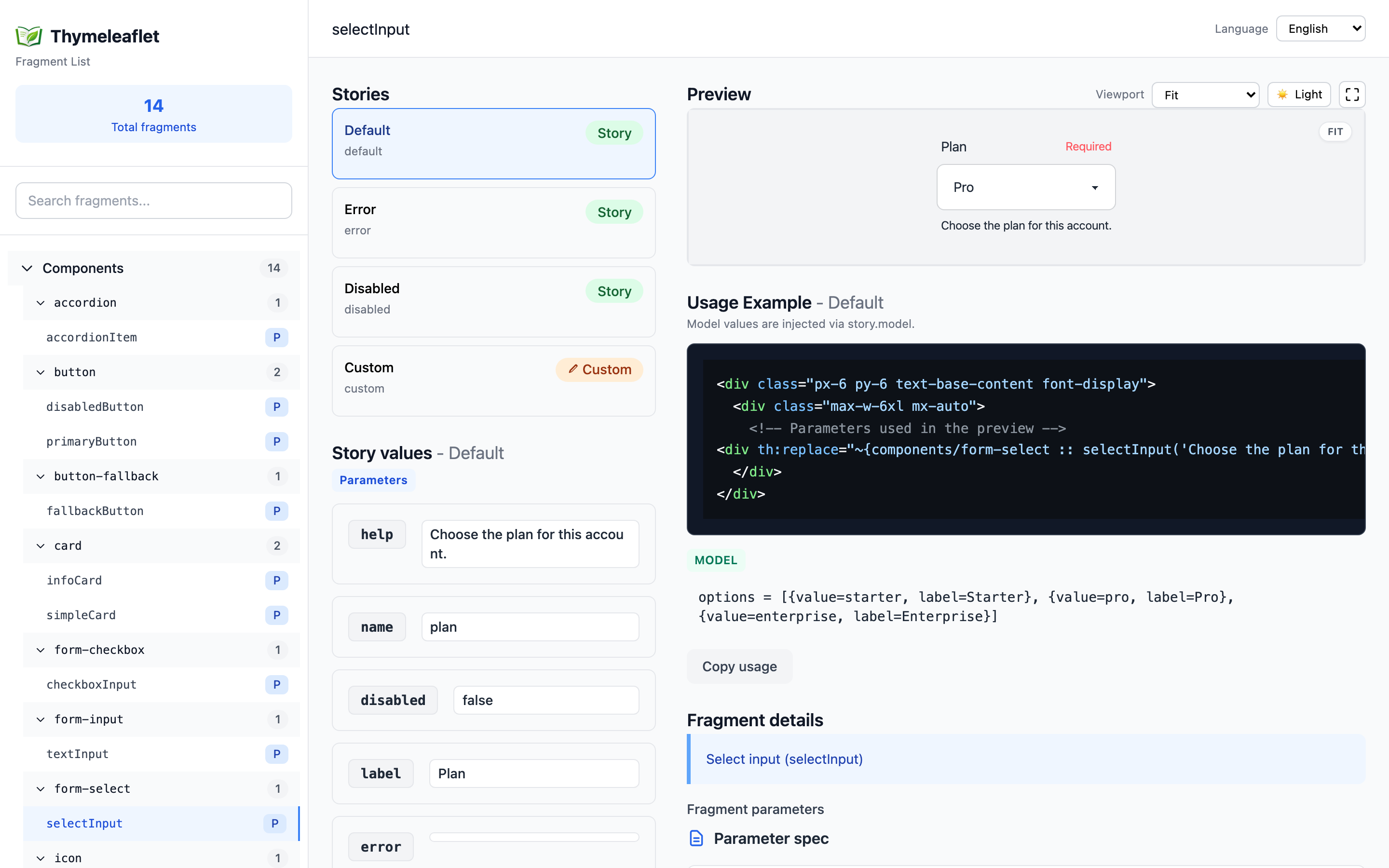
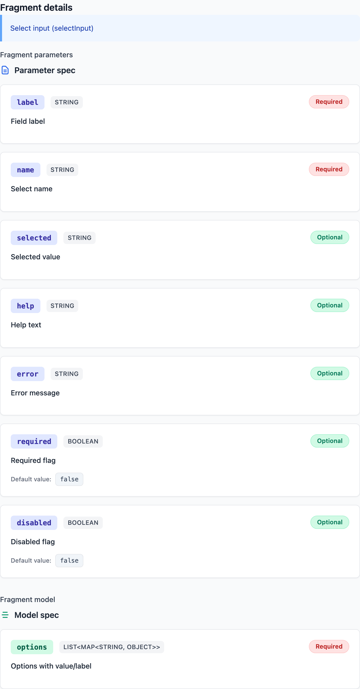
Fragment Details (JavaDoc)
JavaDoc-style comments surface fragment descriptions and model specs.
Keep intent visible and shareable.
/**
 * Select input (selectInput)
 *
 * @param label {@code String} [required] Field label
 * @param name {@code String} [required] Select name
 * @param selected {@code String} [optional=] Selected value
 * @param help {@code String} [optional=] Help text
 * @param error {@code String} [optional=] Error message
 * @param required {@code Boolean} [optional=false] Required flag
 * @param disabled {@code Boolean} [optional=false] Disabled flag
* @model options {@code List<Map<String, Object>>} [required] Options with value/label
 * @example <div th:replace="~{components/form-select :: selectInput(label='Plan', name='plan', selected='pro', help='Choose your plan', error='', required=true, disabled=false)}"></div>
 */
Getting Started
No need to build the starter first.
Add the dependency and start exploring right away.
Details: getting-started.md.
Maven
<dependency>
  <groupId>io.github.wamukat</groupId>
  <artifactId>thymeleaflet-spring-boot-starter</artifactId>
  <version>x.y.z</version>
</dependency>
Gradle (Groovy)
implementation 'io.github.wamukat:thymeleaflet-spring-boot-starter:x.y.z'
Configuration at a Glance
Configure preview viewport widths and background colors via application.yml.
Details: configuration.md.
thymeleaflet:
  preview:
    backgroundLight: "#f6f7fb"
    backgroundDark: "#1f2331"
    viewports:
      - id: mobileSmall
        labelKey: thymeleaflet.preview.viewport.mobileSmall
        width: 360
      - id: tablet
        labelKey: thymeleaflet.preview.viewport.tablet
        width: 834